
High Commissioner for Migration
The High Commissioner for Migration (HCM) is a governmental organization managing the integration of refugees into the national landscape. They asked me to help define and design a platform to help monitor the progress done in each refugee’s file.
Role
UX/UI Designer
Year
2022
The Problem
Due to the high volume of refugees, HCM works with 53 host institutions - composed of managers and volunteers - that assist them during the refugees’ integration program. The reporting system back to the umbrella institution was not streamlined, hindering the data collection and analysis.

My Role
Identified users’ needs and pain points.
Worked with business stakeholders to map out profiles and prioritize features.
Defined end-to-end flows and interactions.
Created Design System based on business materials
Collaborated with the Tech team to define technical solutions.
Meeting the players
The first step was to understand the existing reporting process and the role of the various players involved. Through user interviews, I extracted meaningful insights into the needs and expectations of those involved.
From here I defined the goals of the project: centralize and streamline the reporting process, keep personal data confidential, manage submission deadlines, and empower refugees to submit their own reports.
“Once a migrant or family is signaled by the HCM, we start taking care of their documents and looking for accommodation.”
- Participant 2, 29

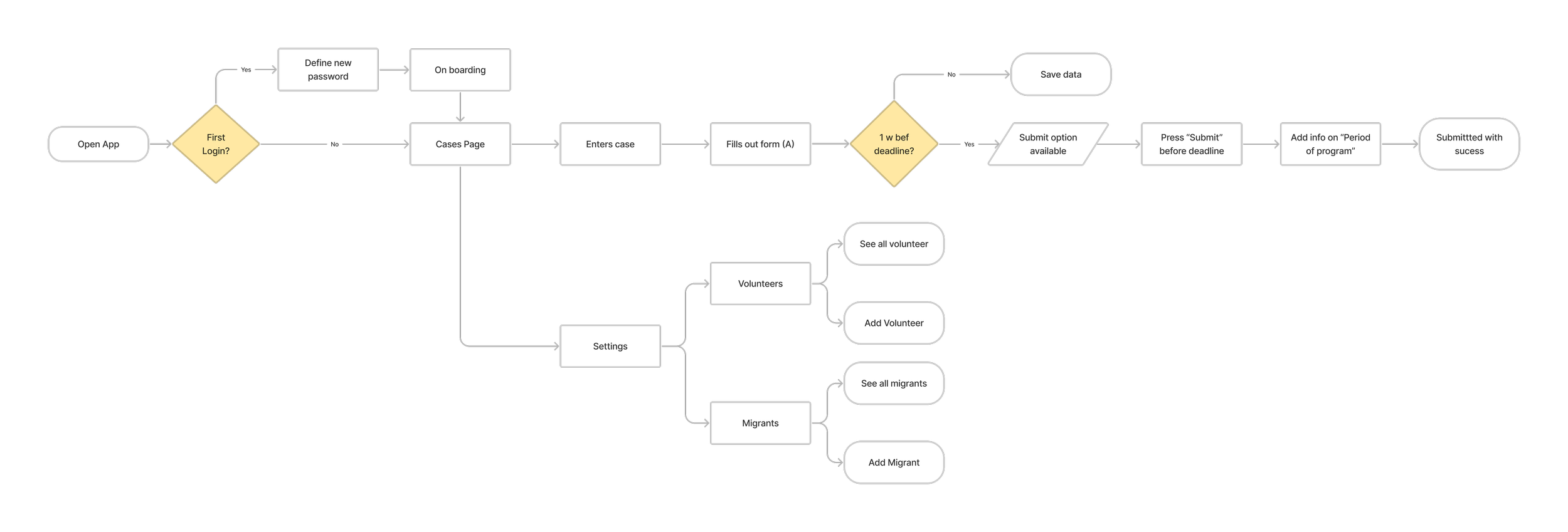
The journey to a centralized solution
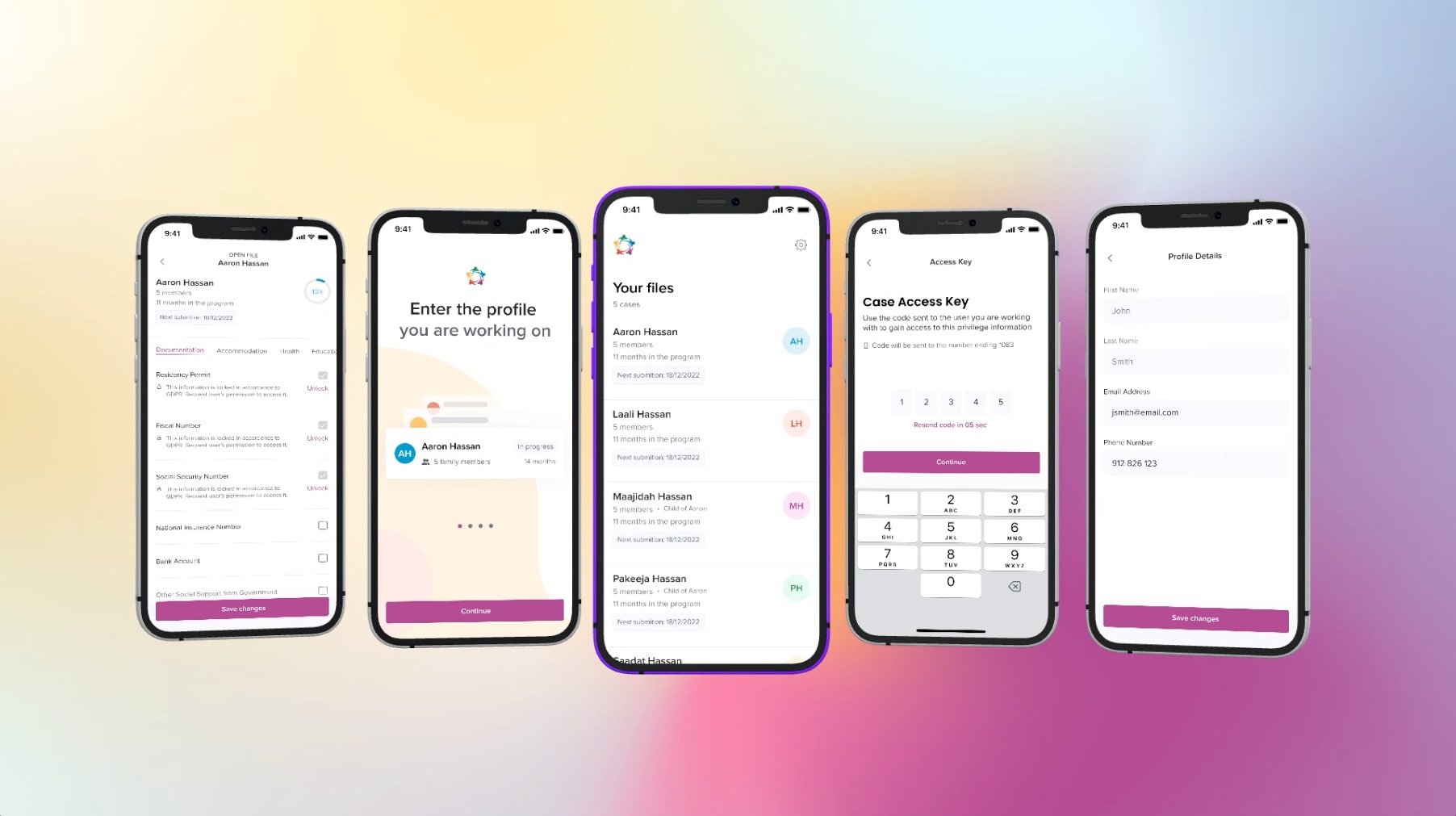
My efforts to create a synchronized platform were crucial to the success of the reporting system. Two user profiles can now fill out refugees’ files parallelly onto a shared platform, increasing data sharing transparency and expediting the process.
I mapped out the interaction of these users and the permissions of each profile.

Bringing it to life
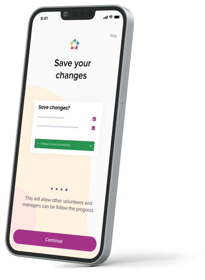
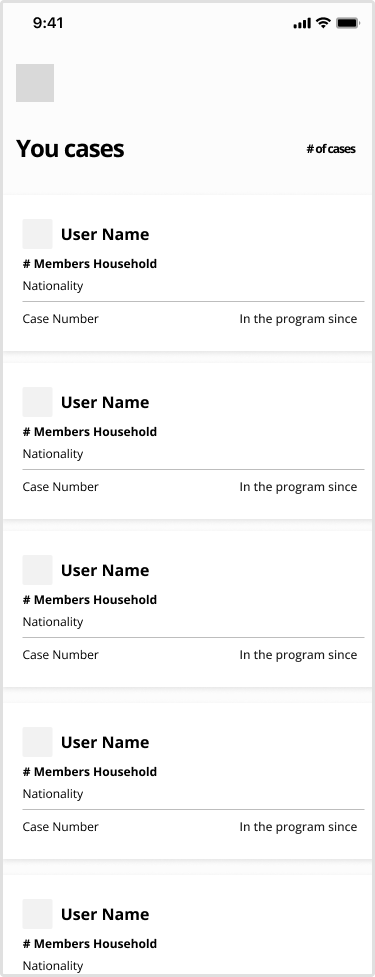
To deliver a successful experience I focused on creating a clean visual language that would decrease the cognitive overload of users. I designed wireframes and low-fidelity screens to explore interface elements on key pages, define the skeleton of the product on different devices, and validate with the business and tech team.
Managers vs Volunteers Profile
Despite using the same platform as the base, the profiles had different requirements and permissions due to their responsibility in the hierarchy. We used that knowledge to develop features based on their roles.

Keep it private
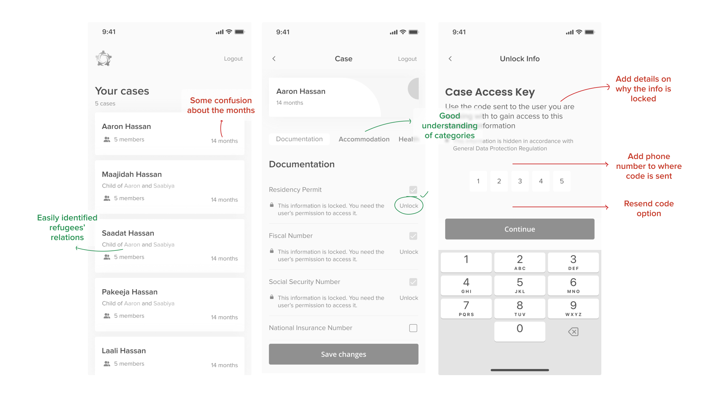
Stakeholders and Host Instituitons’ Managers mentioned the importance of protecting Migrants' sensitive information while still having it accessible by the Volunteers when needed. To add an extra layer of security, the team created a two-device authentication system, allowing Volunteers to consult private information for 2-hours with a Case Key sent to the Migrant's device.

Files status
As assessed in the Discovery Phase, Managers needed an easy way to view file statuses - quickly identifying submission dates and those in critical situations.
For that, I developed a notification system that notifies Managers two weeks before the submission deadline and highlights files in one of four critical statuses. This last status allows Managers to prioritize their work and ensure that no Migrant has expired documents and that Minors are enrolled in school.
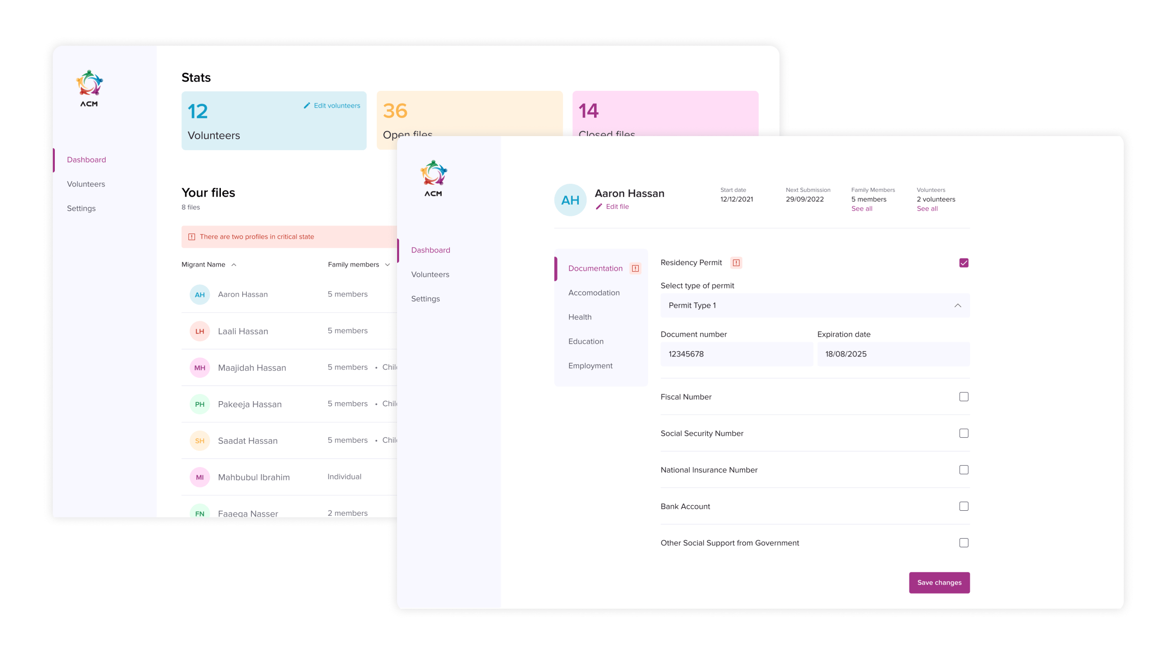
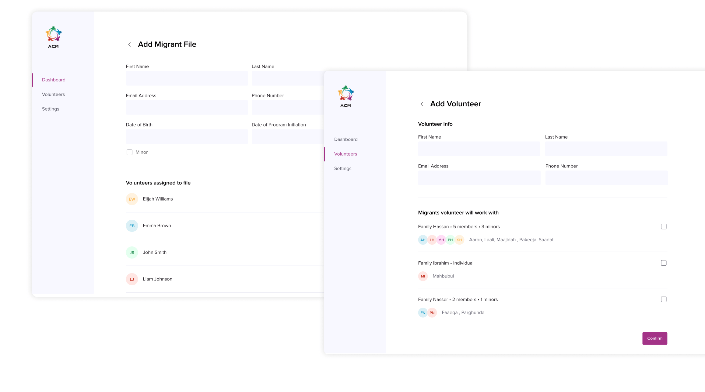
Administer profiles
The Host Institution's Managers are responsible for adding Volunteers and Migrants to the platform during the process. They also need to administer which Volunteer works with each family and grant them access to their file. The Admin desktop version of the platform allows for the administration and matching of profiles.
Validating the designs for success
To ensure the designs were answering users' real needs, I conducted a moderated remote usability test with five users currently participating in the process to evaluate their sentiment towards the proposed design. Three Host Institution Managers and two Volunteers completed six tasks to assess the information architect, consider the features' usability, and diagnose UX/UI and navigation strengths and weaknesses. The insights and observations and the engineers' feedback were fed back into the design iterations.
The prototypes tested positive, completing all tasks by Volunteers and Host Institution Managers.
Participants could identify the files assigned to them in both profiles, although there was some confusion interpreting how long Migrants had been on the program.
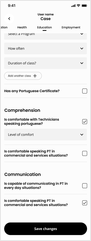
Both profiles were able to edit the profiles successfully, quickly finding the sections of the form the questions were in - COVID under Health and Language class under education.
Users quickly added Volunteers and Migrants from the Manager profile to the platform. However, not all participants interpreted what a family is the same way.
Some participants preferred that that was no distinction between families and individuals when Adding a Migrant to the platform.
MAIN TAKEAWAYS
The Outcomes
I spent 6 weeks working with the HCM to redefine and redesign their reporting experience. The result is a centralized user-centric platform designed for Managers and Volunteers to have full control of the files they are working on.