Santander
Santander operates in 15 countries, 4 of which European. In Portugal, Santander is currently the largest private bank, with 389 branches, with a portfolio of 1.02M digital customers, from its overall 3M, the bank’s strategy is focused on improving customer experience and providing optimized digital solutions for sustained and profitable growth.
For the duration of the project, I worked with teams across other European countries on the redesign of the Santander app to create a richer and more cohesive user experience. The MVP launched in August 2021 and reached 200k users.
Role
UX/UI Senior Designer
Year
2021
THE PROBLEM
During this Digital Transformation, Santander’s goal passed by improving the app’s usability based on the feedback collected over the years, implementing more functionalities using sturdier and safer technology, offering a more accessible digital solution, creating a seamless experience for European clients, and visually modernizing the Santander Portugal App.
The design, business, and technology teams, from different countries, worked together to create cross-countries banking solutions, seamless design patterns, and shared tools and resources.
OUR APPROACH
We gathered customers’ insights and feedback from previous years and went out on the field to talk to understand their current frustrations and pain points and crossed it with other countries’ findings to create a cohesive and meaningful experience.
BETTER VISIBILITY
Customers wanted an app that gave them a better overview of their financial situation and transactions since the previous app required multiple interactions to get to this data.
MORE CONVENIENCE & SIMPLICITY
Most customers mentioned how burdensome and time-consuming it becomes to visit a branch or call Customer Help to perform easy actions that they could perform online.
PERSONALIZED EXPERIENCE
Through the process, we found many customers requesting a more personalized experience. An experience would give them more flexibility on how they see their accounts and products and reflects their personality.
ACCESSIBILITY
Due to the broad age range of customers, we also found respondents that were not as comfortable in the digital world and therefore struggled to interact with elements of the app. As a result, we wanted to make our Santander experience more inclusive of all customers in the digital channels.
Previous Santander Portugal App
Definition & Ideation
The insights gathered and synthesized in the Discovery Phase, combined with the analytics gathered from the previous year, allow us to prioritize the features of the MVP and the scope of work within the given time frame. First, we defined the app’s Information Architecture to understand the complex project’s organizational skeleton. Mapping this out allowed the teams to understand how users would navigate the application and where other Santander’s product offerings could exist.
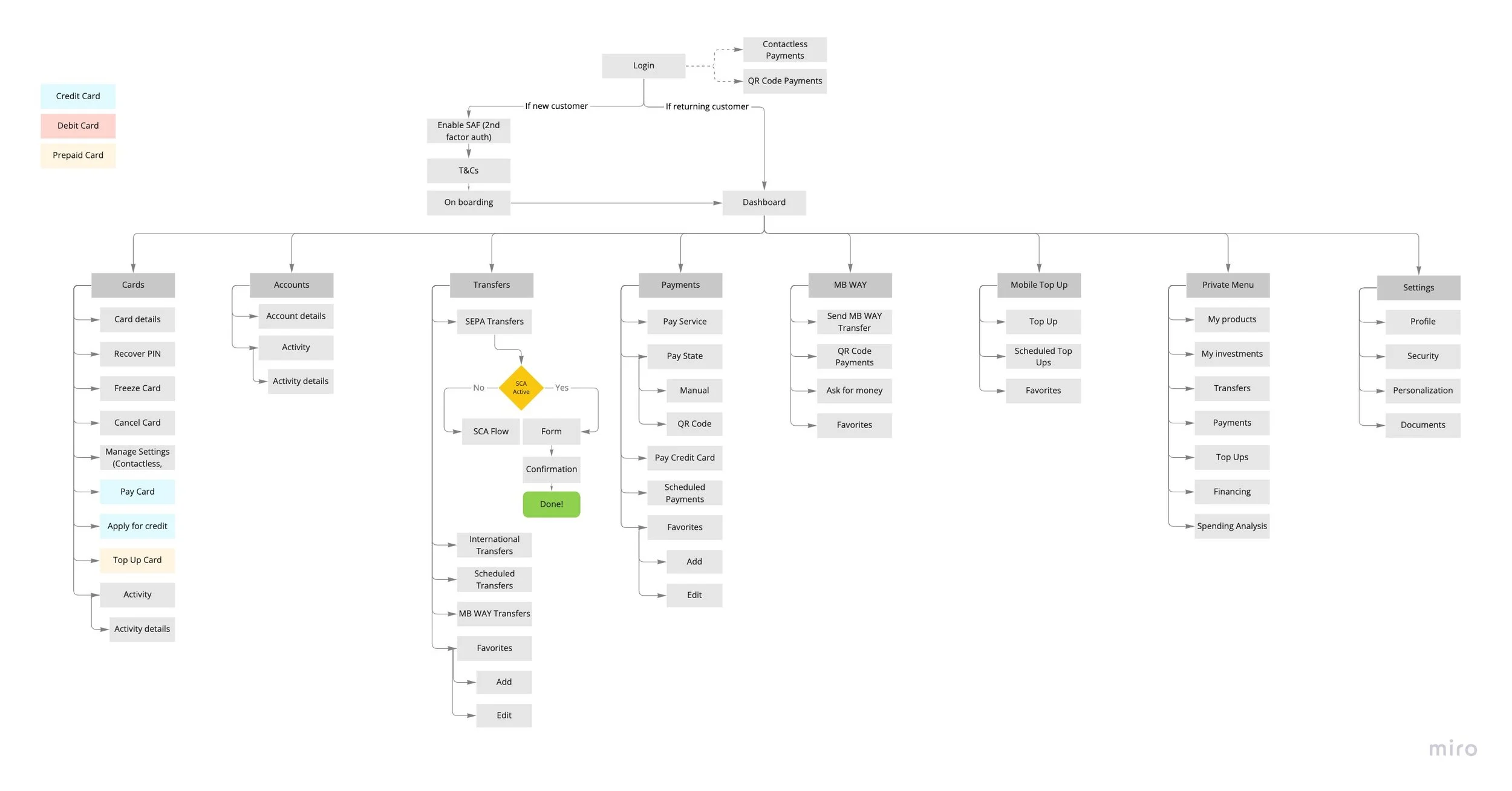
App Map
The design of user flows for the tasks helped the design, technical and business teams identify possible scenarios, options, paths, error cases, technical and business-related dependencies, and their outcomes.

Core Features
The teams worked together across countries to develop core functionalities. Despite their slightly different business and legal requirements, these were developed jointly, ensuring the shareability of tools and code, and creating a unified visual and user experience. These functionalities included onboarding, dashboards, account and card overviews, SEPA and transfers between accounts, and mobile top-ups, among others.
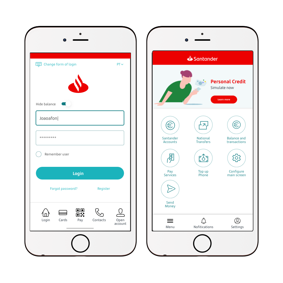
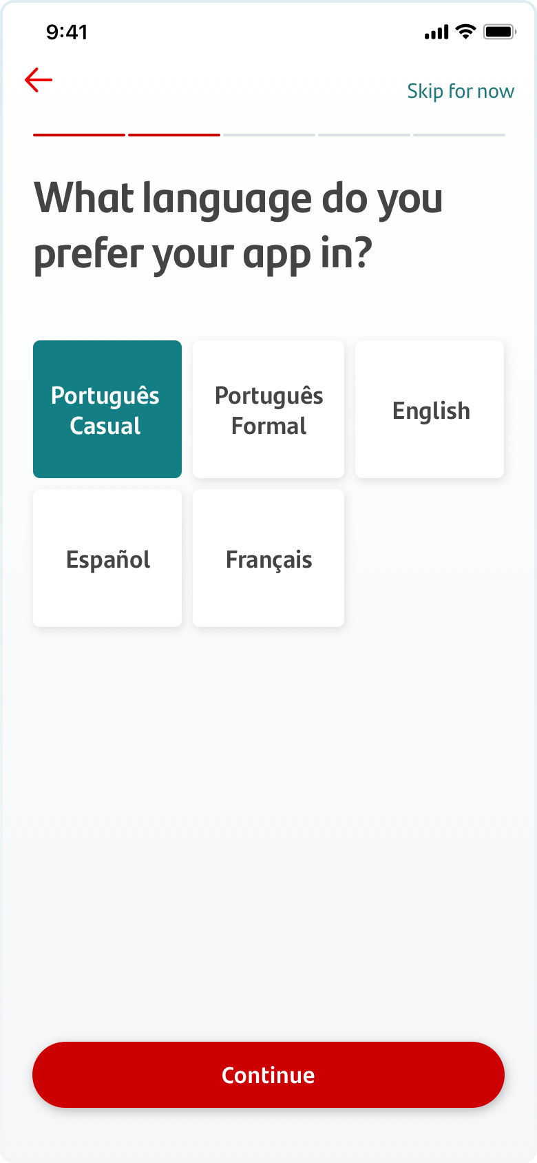
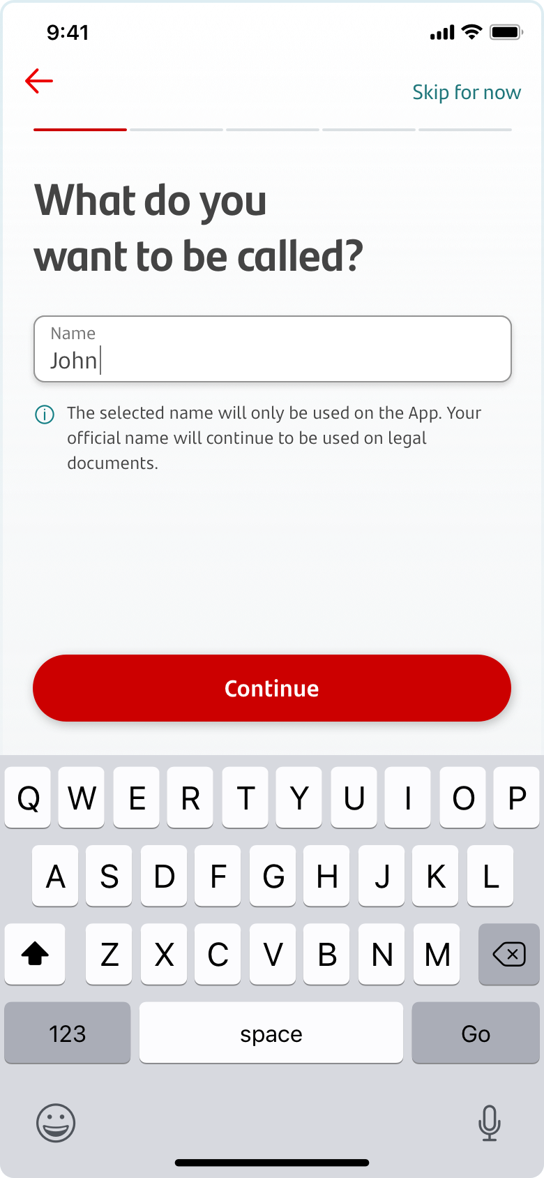
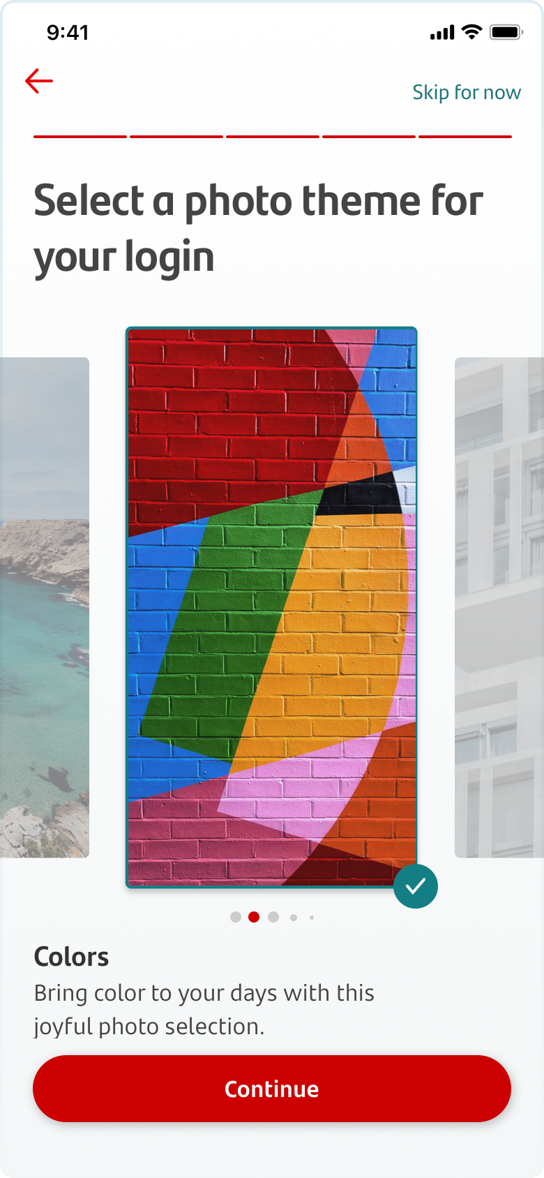
ONBOARDING
Creating a more personalized app came to life by allowing users to define some of the visual components of their app. Through the onboarding, users were able to customize the name to be used in the app, since Portuguese names are long and the first name is not necessarily what one goes by. To cater to a younger audience we allowed users to select Casual Portuguese as a language instead of Santander Formal Portuguese. We also provided the option of selecting a photo theme for the login, where two of the themes were employees’ photos, a marketing strategy used to create buzz and excitement within the community.

Initially, users expect the first login not to be lengthy. However, during the usability test, they become involved as they go through subsequent steps and are ultimately ready to spend more time than initially planned. They are willing to “invest” time to benefit from precise customization to their needs.
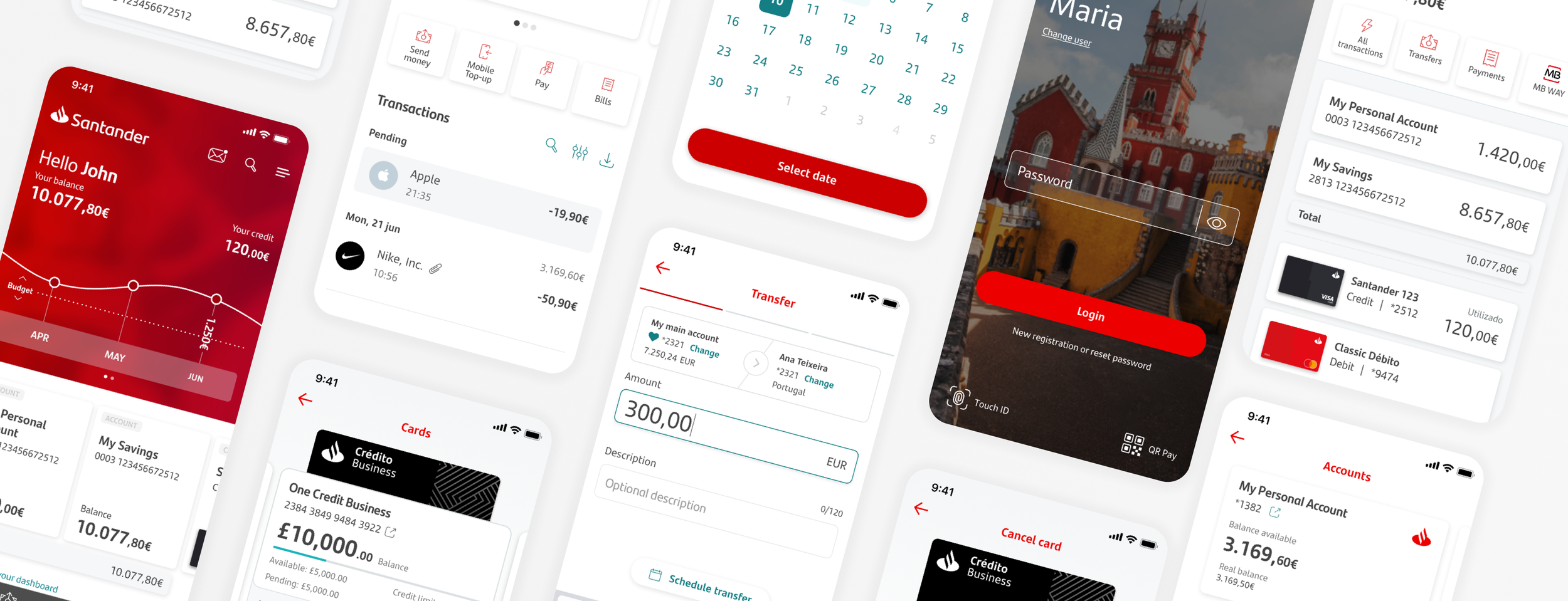
MULTIPLE DASHBOARDS
We wanted customers to feel empowered by having visibility of their financial situation and choosing the dashboard that worked best for them, as the previous application did not allow them to do so. Therefore, we explored multiple dashboard layouts and developed three final dashboards that better-suited users’ needs and business goals.
All dashboards included an overview of the customers’ balance, credit and banking products, shortcuts to main functionalities, and bank offering sections towards the end.
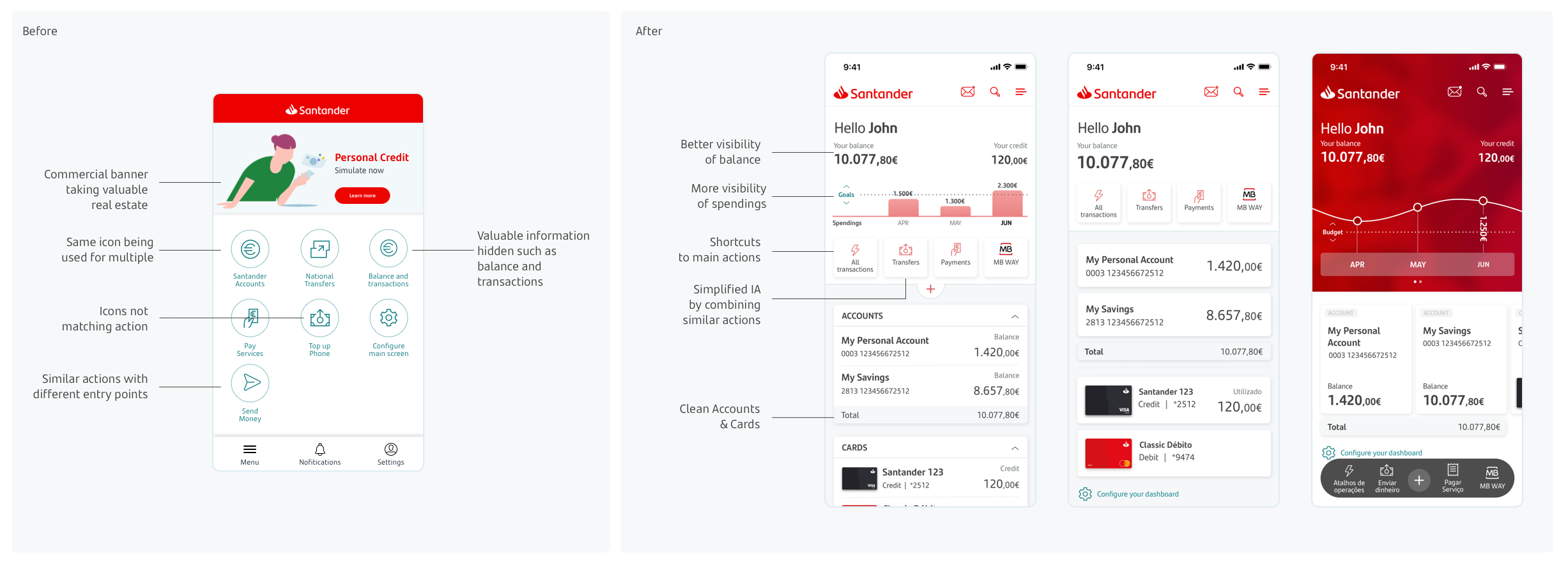
From the usability test, we concluded The Simple Dashboard was the most popular one among respondents, due to its clean look, legibility, and minimal cognitive overload. User 87% felt it was easy or very easy to find the balance associated with different products. When prompted to check their credit card transactions 85% of respondents chose the card section, while when looking for debit card ones 56% entered the card area, and 35% entered the account one.
TRANSFERS
Transfers were one of the first features the teams tackled as they ranked one of the most used functionalities from the previous year.
When discussing with users the mental model followed during a transfer, respondents mentioned that they start by choosing a recipient and later define the amount and add an optional description. The teams decided to create a step-by-step task to provide flexibility to all countries’ requirements, such as IBAN/Sort Number formats, currency value and format, and the favorites’ initials on badges.
From analytics, we concluded that 86% of transfers were done from customers’ main accounts, so we defaulted the account on step 2 with the possibility to change it later.
Transfers are also mostly done to a recurring or saved contact and users have an average of 8 favorites. So with that in mind, we led the flow with a highlighted section of Past and Favorite recipients.
TRANSACTION DETAILS
During the redesign, teams worked internationally to improve the transaction overview and details. The goal was to provide more valuable information at this stage as the previous app lacked detail and showed encrypted data not understandable to the regular consumer.
Working closely with the business teams, we started by identifying the types of transactions and data fields available on the back end as well. Next, the teams determined what fields were relevant per type of transaction and created a modular system that allowed flexibility for each transaction type.
Hover images to find out more
Before
After
Local Features
Unlike the CORE functionalities, local features were country-specific, presenting local business and legal requirements. For these features, design and engineering teams worked within their countries to ensure the architecture and experience, from a design and technology standpoint, were followed.
ACCOUNT ACTIVATION
Users can only make transactions and change account settings in the app after their identity has been authenticated through a call center phone call. Since this process varied greatly between countries the teams took it separately.
Users were allowed to authenticate at several moments in the app - during the first login, during the onboarding process, when entering a feature that requires said authentication, or on the settings menu.
The authentication process created was smooth and intuitive, translating into a low dropout rate.
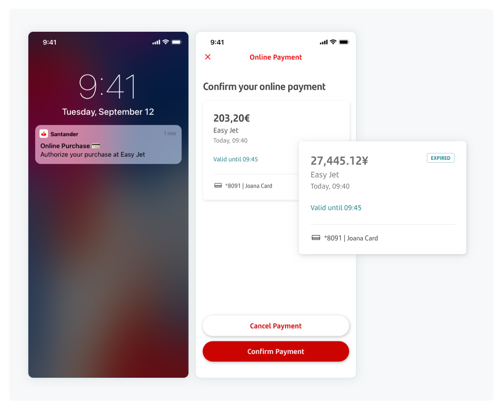
3D SECURE
The implementation of 3DS was a business and legal priority as it added an extra layer of security when making online purchases. To implement this functionality, we created an intuitive workflow that allowed users to accept online purchases through the app on their mobile devices.
We faced technical challenges with this feature, as we had to consider multiple currencies, international phone numbers, and third-party timer constraints.
QR CODE PAYMENT
QR Code Payments have become increasingly popular nationwide in the past few years. To stay relevant Santander made this a priority feature.
The entry point for this functionality was featured on the main screen, allowing easy access to users. However, to use and browse different cards customers were requested to log in through an alternative login first.
The designed experience proved to be intuitive and easy to use.

Shared tools
During the project the design teams worked together to create shared tools and streamline the work.
DESIGN SYSTEM
At the start of the project, the teams used the Spanish App as a starting point for their designs. However, there were multiple inconsistencies between screens and platforms due to the lack of a UI Kit and the number of members on the design and engineering teams.
As the design teams moved forward with the flows and made design decisions, we got together with the engineering teams to develop a sturdy and scalable design system that could be adapted to everyone’s needs while staying true to the visual and design patterns agreed.
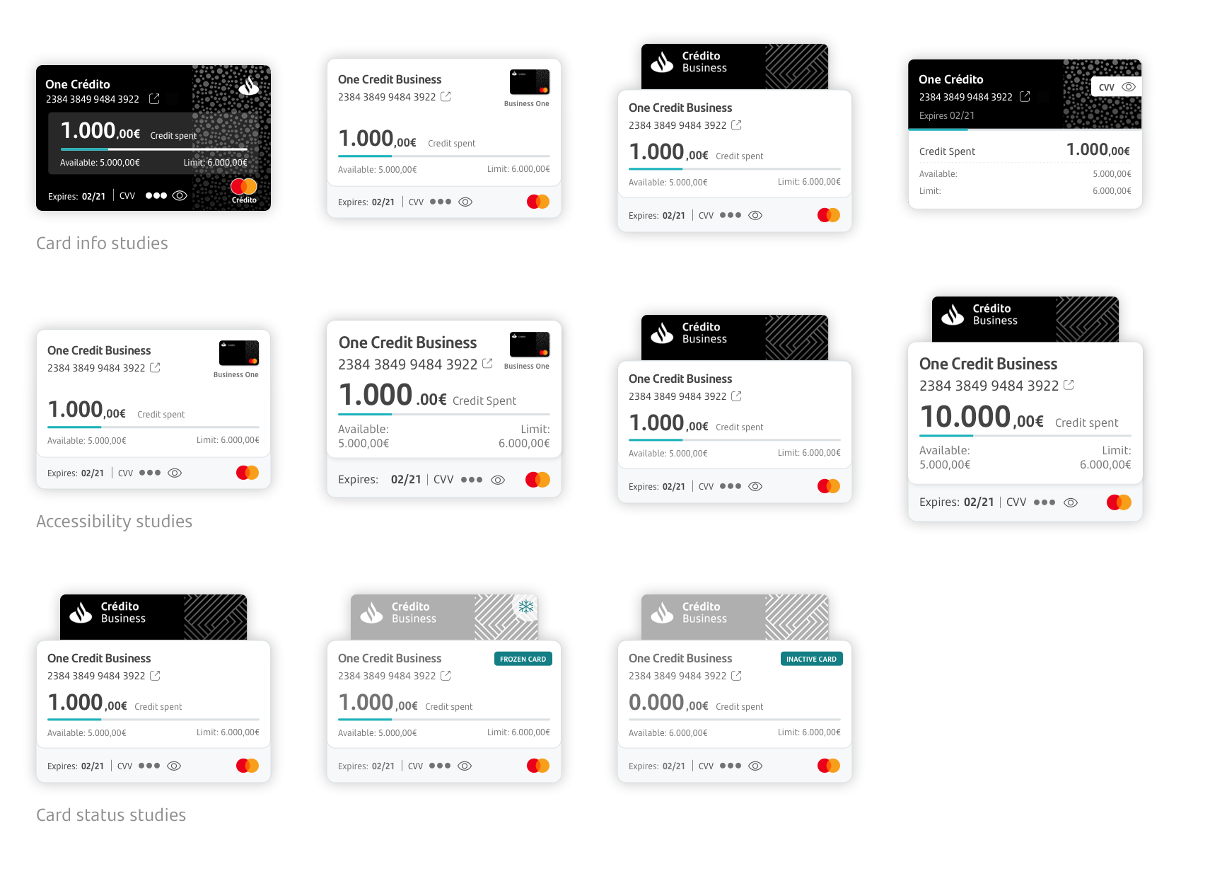
SCALABILITY & ACCESILITY
While designing cross-countries solutions it was imperative to have in mind the different requirements from each country from a business and legal perspective. Not all countries needed to display the same information in the card section.
It was also important to guarantee we were designing an inclusive solution, that would allow users with visual impairment to use the digital channel to its fullest.