
Gondomar Clinic
Gondomar Clinic is a trusted private health facility with over 40 years of experience in northern Portugal, offering 20 medical specialties to its loyal customers. I have teamed up with the new management team to design a new website to optimize their appointment booking process, boost the adhesion to the clinic's loyalty card, and attract a younger audience.
Role
UX/UI Designer
Year
2022
THE PROBLEM
Gondomar Clinic had a limited and static digital presence filled with outdated information. Most interaction with their services happened through the phone call, which imposed an issue to the clinic's customer center. The management wanted to optimize their offering by digitalizing and making some processes more efficient.
WE STARTED BY UNDERSTANDING
To create a site that truly served the business’s goals I had to first understand the healthcare landscape and the users’ needs, goals, and pain points.
LISTENING TO THE USERS FIRST
I conducted one-on-one remote interviews with five participants, ranging from 29 to 59, to further understand what patients look for when choosing a health facility. In addition, I ran a stakeholder interview to identify other business aspects to consider during the process.
“I trust my health facility to choose the doctors, however, I like to see their profile on my own”
- Participant 5, 56
TAKEAWAYS
Through the research, I could identify some common patients' behaviors and preferences. Most patients report choosing their health facility based on its location and convenience, followed by the portfolio of doctors the clinic offers. Respondents also mentioned they prefer to visit health facilities they have previously been to. Online booking was the preferred method for getting an appointment, with respondents emphasizing that the automated system saved time and headaches.
I could identify the main frustrations and pain points respondents experience during booking processes. These include difficulty encountering the booking form, asking for unnecessary documentation, long booking forms, not realizing their booking was pending confirmation, system failing, and unexplained error messages.
“Most calls we get are from patients wanting to book appointments, or asking our location (…) Our phones don’t stop ringing. We get calls every 3 to 5 mins.”
- Receptionist, 47
Patients call the clinic mainly to book appointments, request directions, and ask for exam preparation details. The age of patients calling and coming to the clinic varies significantly due to its good location that attracts people of all ages.
DEFINITION & IDEATION
Combining the insights from the interviews with the competitors' analysis was the starting point to create a concise site map that kept all the important information at the top level of the navigation. I later designed user flows for the main tasks users would be able to perform on the website, to map out various scenarios one could encounter.
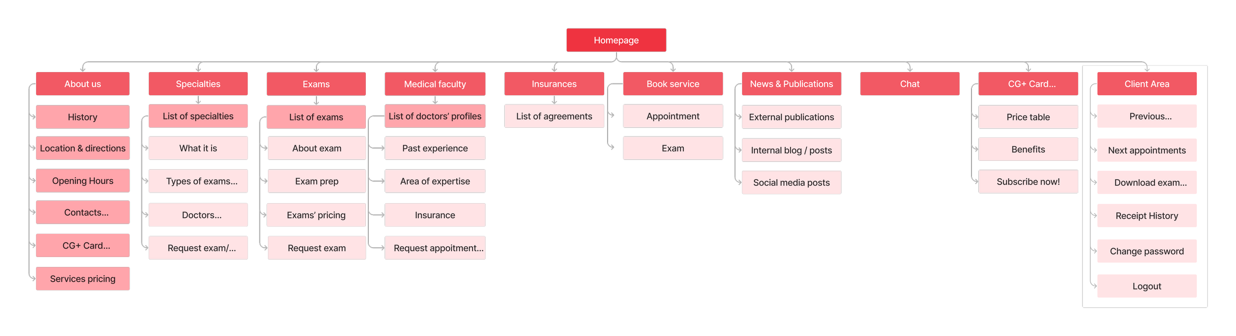
Site map

Request an appointment User Flow

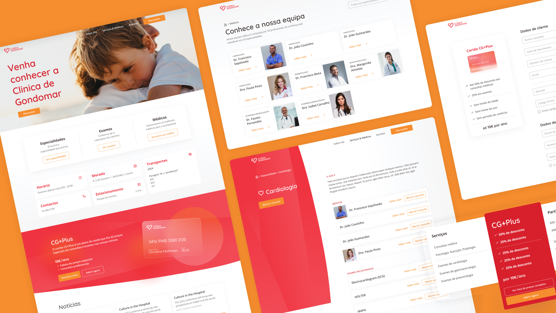
WIREFRAMES
The team sketched preliminary ideas to introduce solutions to the business’s objectives and users' pain points, starting to materialize how the layouts would look and work across platforms and devices.
MID FIDELITY PROTOTYPES
I later started crafting mid-fidelity prototypes based on the brand’s look and feel. The prototype was taken into usability testing to measure the success of the information architecture, navigation, and usability principles.

REQUEST BOOKING & CONFIRMATION
One of the business’s goals was to allow customers to request the booking of an appointment and/or exam, decreasing the number of incoming calls to the clinic. During the research, I concluded that patients most times looked for the closest appointment date, so we ensured I highlighted those dates on the main booking form. Patients were also looking for short and straightforward forms; therefore, we established a simple system with only the necessary inputs. It was also crucial to guarantee that patients were aware their booking was pending confirmation; for that, I added notes and a check box with that information, and all patients, during the usability test, understood their booking was waiting for a call of approval.
Also, all respondents identified the booking entry point and completed the booking successfully.
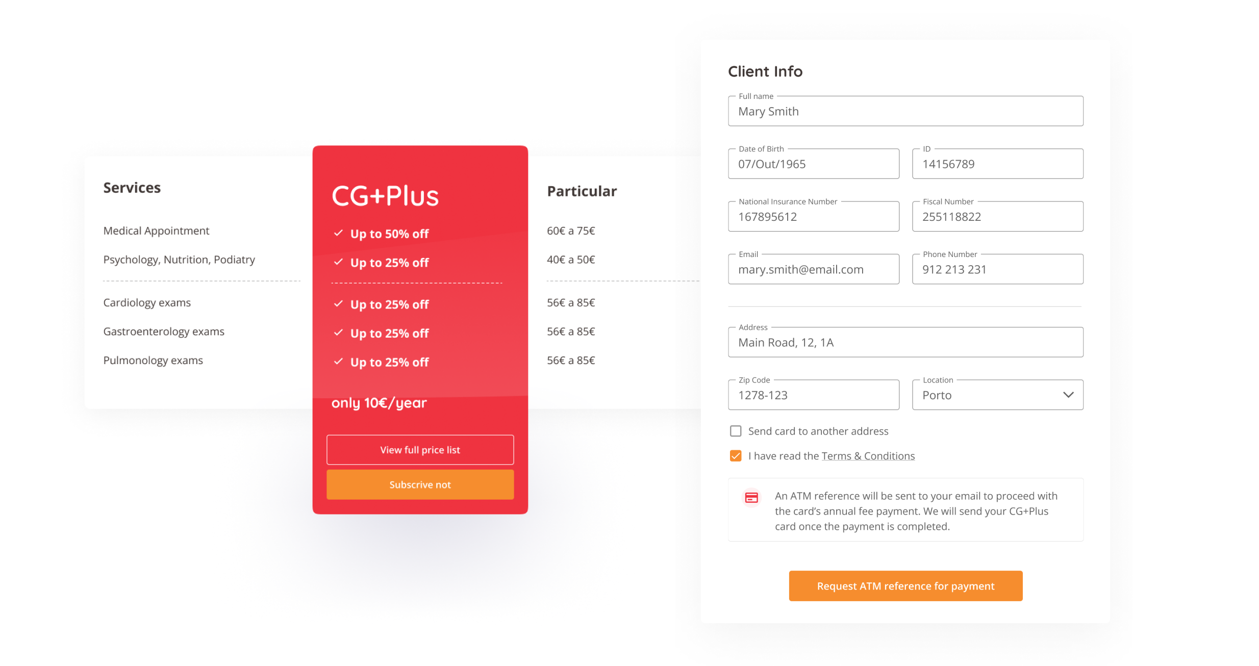
SIGN UP FOR CARD & PAYMENT METHOD
The business wanted to use the website for advertising its fidelity card and automatically allowing patients to sign up and pay for it online. I created a banner on the landing page with that intent and a page dedicated to explaining the card’s benefits and showcasing the pricing table. Working with the engineering team, we defined an automated payment system through the ATM, in which users receive a message on their mobile device or an email to complete the payment. The process is completed once a confirmation email is received and the card is sent to the defined shipping address.
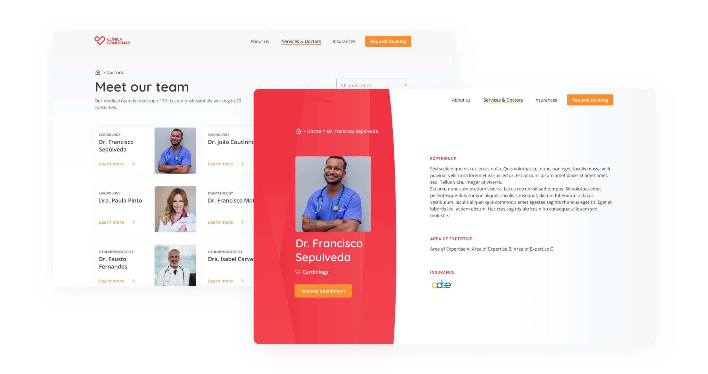
PRODUCT PAGES
From research I concluded patients visit a health facility website to read more about its doctors’ profile and in case of exams, patients often call the clinic about the the preparation of the same. For that I created profile pages for both 50 doctors and exams with relevant information to be hand to any patient. From this pages, patients can request appointments and exam bookings.
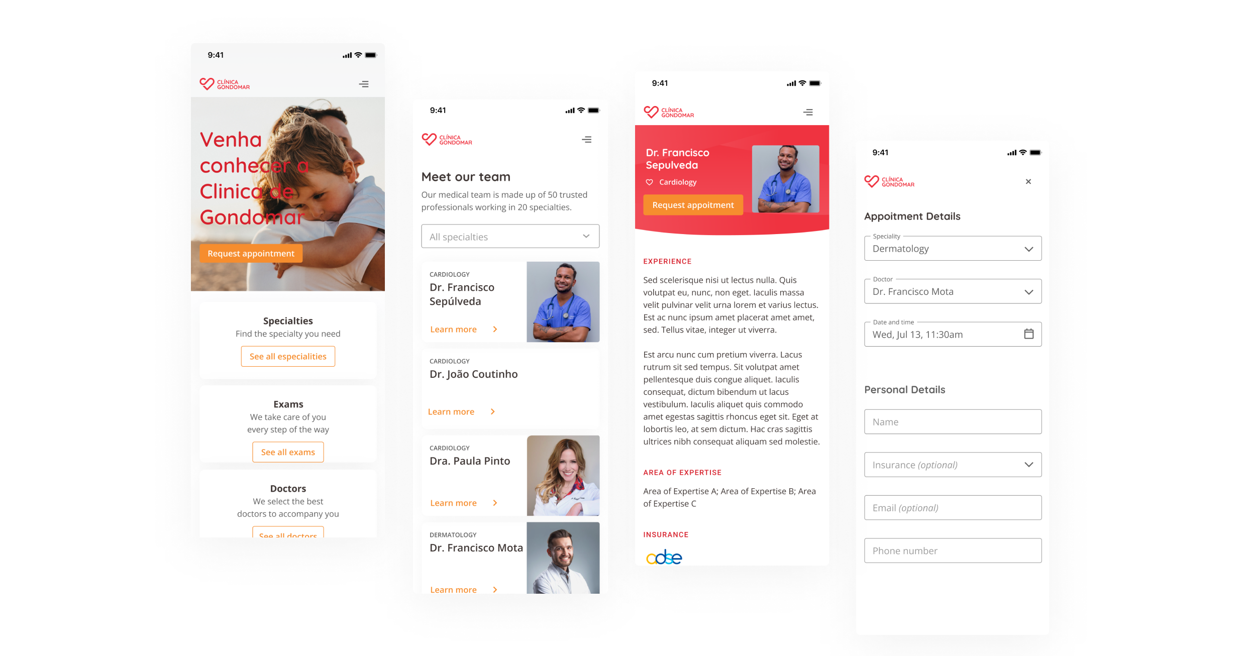
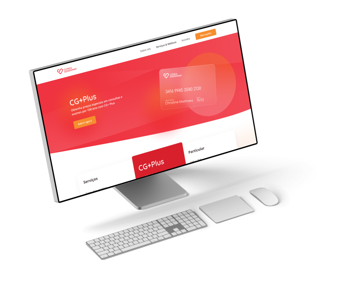
DESKTOP & MOBILE
I also created a responsive mobile version of the website to ensure the patients could would have an optimize and smooth experience from any device.
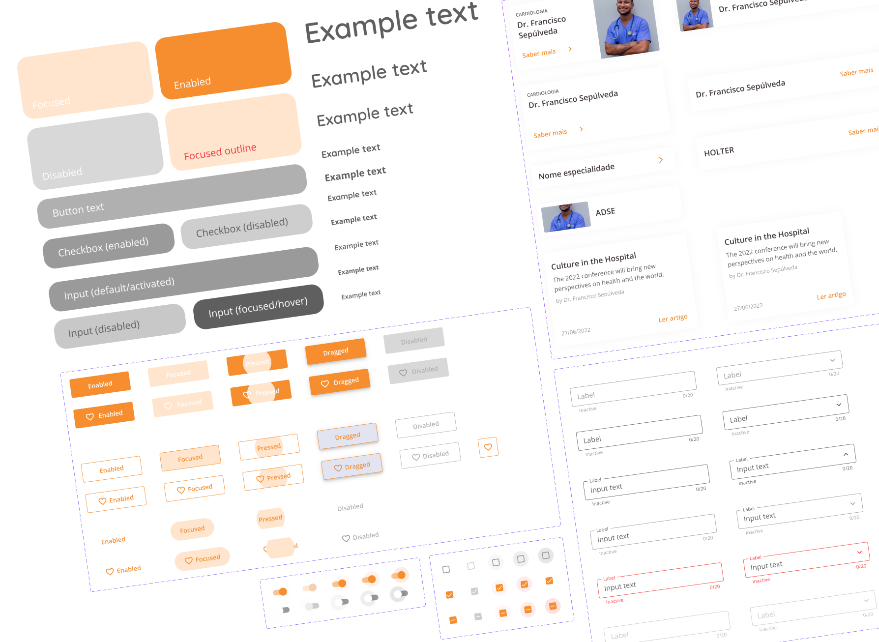
DESIGN SYSTEM
The brand's design language informed the design system I created for the brand. The design system was composed of different components to help our workflow. With this approach, we built a structure that was coherent through the site on desktop and mobile.
THE RESULT
Seamless user experience
The architecture information allowed for a frictionless user experience, with users easily finding the content they were looking for.
Business goals achieved
Business’s priorities of automatizing the appointment booking process, and providing a digital way to subscribe to their loyalty card were accomplished.
New Design System
The new Design System gave a modern look that differentiates Gondomar Clinic from its competitors. In addition, it provided the team with an organized and scalable tool for the future.
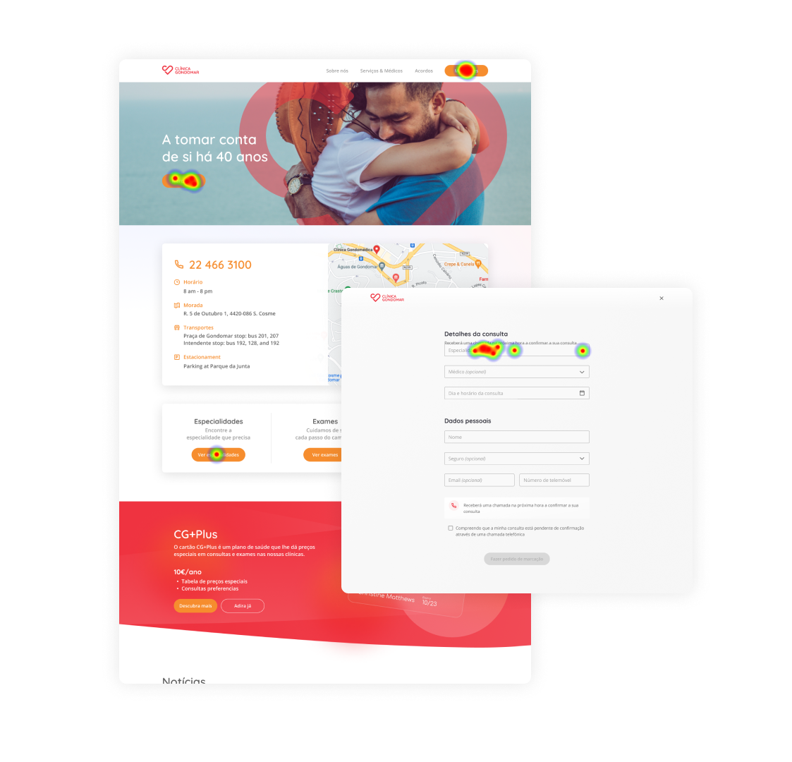
USABILITY TEST
User testing results were successful, proving the new User Journey worked well, the information architecture was well-conceived and the User Experience seamless.
The study was an unmoderated remote usability test, conducted using the analytics tool Useberry, with the goal of identifying areas of friction or error that may prevent the completion of specified tasks. Twelve participants took the test and were asked to perform 4 tasks - booking an appointment, consulting a doctor’s profile, visiting an exam page, and subscribing to the loyalty card. All tasks were completed with a 100% success rate.